

Visual Branding for Educational Software Business
Logos, Display Ads, Point-of-Purchase Displays, etc.
For D.E.D. Electronic Publishing (a.k.a. Drenkow Media).
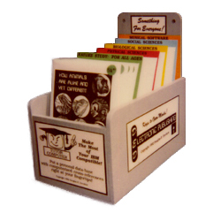
Retail Tabletop/Pegboard Point-of-Purchase Display
For displaying my wide variety of inexpensive software in college bookstores and other retail outlets, I created this bin, with 5.25" & 3.5" disc versions of the software in envelopes that I labeled, color-coded, and organized by subject matter with laminated dividers (Biological Sciences, Physical Sciences, etc.).
Note the “Computer Tutor” mascot and my “Keys to Open Minds” logo (See below).
“Praying Mantid” Literature Holder
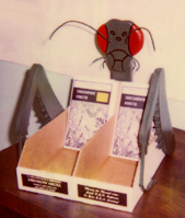
For several years Drenkow Media (a.k.a. D.E.D. Electronic Publishing) purchased space at the book table in the national convention of the Entomological Society of America. One year I created this very unique display for bins of literature promoting Discovering Insects, skewed towards a younger demographic.
The display was the talk of the show!
“Diskette” Booklet
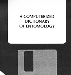
For another year at the ESA convention, to promote my Computerized Dictionary of Entomology, I created a little handout booklet whose cover resembled a 3.5" floppy diskette — the common media of the day.
Please click image for full-size copy of the entire text of the booklet, including very thorough information about the work as well as a small order form. ![]()
Display Ads
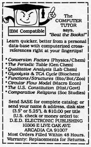
I created this and similar ads for my educational software and posted them in college newspapers nationwide. Note the use of the college-mascot-style “Computer Tutor,” for eye-catching branding (and system requirements).
“The Computer Tutor” Mascot
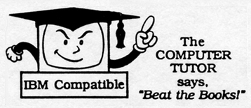
I created this logo in the style of mascots at colleges, where my principal market resided. This logo — accompanied by copy reinforcing the idea that educational software held advantages over books — appeared in college newspaper ads and a tabletop display.
D.E.D. Electronic Publishing: “Keys to Open Minds!” Logo
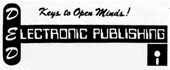
Later called Drenkow Media, my educational software company was originally known as D.E.D. Electronic Publishing, for which I created a logo incorporating a personal font (Brush Script) for my initials and the tagline, a “computer font” for Electronic Publishing, a “key” design that tied it all together (with a 5.25-inch floppy diskette, common at the time, at the “business end” of the key), and a tagline that summed up my enthusiasm for the potential of new media: “Keys to Open Minds!”
This logo appeared in display ads, sales literature, and instruction sheets as well as on packaging and a tabletop display.
All Rights Reserved. Legal Notices.